The intricate world of gold trading often hinges on the ability to read and interpret price charts with precision. These visual tools condense vast amounts of data into digestible formats, enabling traders, investors, and analysts to spot emerging trends, identify key levels of support and resistance, and make informed decisions under dynamic market conditions. Whether you are building a diversified portfolio or hedging against inflation, understanding chart patterns and indicators is essential for managing risk and capitalizing on opportunities. This guide delves into various chart types, technical signals, pattern recognition techniques, and global factors that influence the world gold market, empowering you to refine your strategy and navigate fluctuations in precious metal prices.
Understanding Different Chart Types
At its core, a price chart is a graphical representation of gold prices over a defined period. Selecting the right chart type can streamline your analysis and highlight the most relevant price behavior. The three most common formats are line charts, bar charts, and candlestick charts. While line charts offer a simplified view of closing prices and long-term trends, bar and candlestick charts provide granular insight into intraday fluctuations, capturing opening, high, low, and closing values.
Bar charts display price movement with vertical bars and horizontal tick marks for open and close, facilitating quick identification of price ranges. However, candlestick charts combine visual clarity with actionable data: a filled or hollow “body” represents the direction of price movement, and thin lines or “wicks” extend to the period’s high and low. The color-coded bodies make it easier to spot bullish or bearish sentiment, while various candlestick formations can signal potential reversals or continuations.
Beyond these basics, traders often overlay trendlines directly onto price charts. An upward trendline connects a series of higher lows, revealing an overall bullish bias, whereas a downward trendline links lower highs to signal selling pressure. By monitoring breaks above or below these lines, investors can detect shifts in momentum early. Additionally, horizontal lines drawn at historical price peaks and troughs mark critical support and resistance levels, areas where buying or selling interest tends to cluster.
Key Technical Indicators for Gold Analysis
While raw price charts show where gold moved, technical indicators help explain why it moved and where it might go next. Indicators fall into two categories: trend-following (lagging) and momentum (leading). Trend-following tools excel at confirming existing movements, whereas momentum indicators can hint at potential reversals before they unfold. Combining them in your analysis toolkit can improve timing and reduce exposure to false breakouts.
- Moving Averages: The Simple Moving Average (SMA) and Exponential Moving Average (EMA) smooth out price data to illustrate prevailing trends. A common strategy involves analyzing the crossover of the 50-day and 200-day EMAs to detect bullish or bearish signals.
- Relative Strength Index (RSI): This momentum oscillator measures overbought or oversold conditions on a scale of 0 to 100. Values above 70 often indicate overbought territory, while readings below 30 suggest oversold levels.
- MACD (Moving Average Convergence Divergence): By plotting the difference between two EMAs and a signal line, the MACD highlights momentum shifts. Crosses above the signal line can signal bullish momentum, while crosses below may indicate weakening strength.
- Bollinger Bands: Bands plotted a fixed number of standard deviations around a moving average visualize volatility. When price touches the upper band, the market may be overextended; interaction with the lower band suggests potential buying interest.
- Fibonacci Retracements: Derived from the Fibonacci sequence, these horizontal lines mark potential reversal levels at key percentages (23.6%, 38.2%, 50%, 61.8%). Traders watch for price pauses or reversals at these zones during pullbacks.
By combining trend-following and momentum indicators, one can filter out noise and validate entry or exit points. For instance, confirming a breakout above resistance with volume spikes and RSI confirmation reduces the likelihood of a false move. Regularly backtesting these signals on historical gold data builds confidence in your chosen setup.
Interpreting Patterns and Trends
Chart patterns are visual shapes formed by price movements that often precede predictable directional shifts. Recognizing these formations equips analysts with a framework for anticipating possible outcomes. Popular patterns in gold price charts include head and shoulders, double tops and bottoms, triangles, and flags. Each has distinct characteristics and implications for future price action:
- Head and Shoulders: A bearish reversal pattern consisting of three peaks, with the middle peak (head) higher than the two shoulders. A break below the neckline confirms a trend change.
- Inverse Head and Shoulders: The bullish counterpart appears at market bottoms, indicating potential upswings once the neckline is breached.
- Double Top and Bottom: Two trials of a price level followed by failure to sustain momentum signal reversals. A break below the intervening trough (double top) or above the intervening peak (double bottom) offers entry points.
- Triangles: Symmetrical triangles reflect market indecision, bullish triangles favor upward breaks, and bearish triangles trend lower on exhaustion. Volume often contracts before a decisive move.
- Flags and Pennants: Short consolidation zones after sharp moves tend to resolve in the direction of the prior trend, making them continuation patterns.
Monitoring the volume that accompanies these patterns is crucial. Higher-than-average volume on pattern confirmation underscores strong conviction among participants. Conversely, weak volume raises doubts about sustainability. Integrating volatility measures, such as Average True Range (ATR), can help set targets and stop-loss levels, ensuring disciplined risk management during pattern-based trades.
Global Factors Affecting Gold Prices
Gold’s role as a safe-haven asset and store of value means its price is sensitive to a wide array of macroeconomic and geopolitical drivers. By correlating chart movements with external events, traders gain deeper context for sudden spikes or prolonged trends. Key influences include:
- Interest Rates: Lower real rates make non-yielding assets like gold more attractive. Expectations of rate cuts often propel prices higher, while hawkish central bank policies apply downward pressure.
- Currency Movements: Gold is typically inversely related to the US dollar. A stronger dollar reduces gold’s appeal to holders of other currencies, compressing demand.
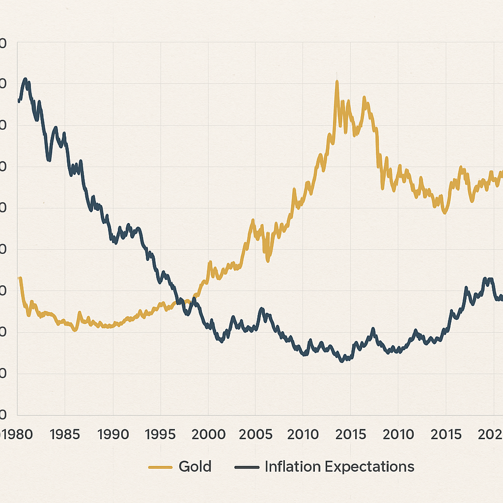
- Inflation: As a hedge against purchasing-power erosion, gold often rallies amid rising consumer prices. Inflation surprises can trigger rapid shifts in chart slopes and breakouts.
- Geopolitical Risk: Conflicts, trade tensions, and political instability drive safe-haven flows. Sudden jumps in chart volatility often coincide with major news events.
- Central Bank Demand: Official purchases or sales by major banks influence both physical and paper markets. Announcements regarding reserve diversification can trigger chart breakouts.
- Supply Constraints: Mining output disruptions or changes in recycling rates affect physical availability, subtly impacting long-term chart trends.
Understanding the interplay between these factors and price chart formations allows for more nuanced analysis. Staying current with economic calendars, policy announcements, and global news feeds equips analysts with the context needed to interpret sharp spikes, gradual uptrends, or sideways consolidations in the gold market. Integrating these insights with technical patterns and liquidity considerations lays the foundation for robust trade planning and more effective risk control strategies.